

【中美创新时报2024 年 9 月 22 日编译讯】(记者温友平编译)今年竞选总统的卡玛拉·哈里斯与 2019 年首次竞选公职的候选人相比发生了很大变化——只要看看她在水力压裂、单一支付者医疗保健和枪支回购计划方面的温和立场就知道了。《波士顿环球报》记者艾玛·普拉托夫(Emma Platoff )对此作了下述报道。
或者你可以只看标志。特别是竞选标志。


随着哈里斯逐渐放弃她第一次竞选时的一些进步立场,在向中间派转变的久经考验的大选策略中,她也在用一种不那么明显但同样明显的手段来传达她的政治重新定位:她的视觉品牌。
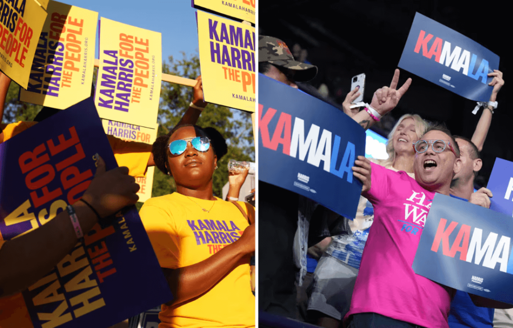
哈里斯放弃了她在第一次竞选中采用的鲜艳的紫色、红色和黄色配色方案,转而采用更传统的美国蓝色、白色和红色色调,设计师称这种视觉变化符合她的政治故事。2019 年的标志性三部分标志——黄色“KA”、紫色“MA”、红色“LA”——在 2024 年被重新设计为红色、白色和蓝色。
哈里斯修改后的配色方案从字面上说明了试图在拥挤的民主党初选中获得支持与讨好整个国家的民主党人、独立人士和心怀不满的共和党人之间的区别。从五年前希望在进步初选选民中站稳脚跟的加州初级参议员,她迅速成为民主党的旗手;她继承了一位更中立的总统的竞选活动,现在正试图避免疏远任何可能的选民。
专家表示,哈里斯的视觉呈现、设计和竞选标志的转变也必须反映这一点。因此,她提供了小企业税收减免和大胆的蓝色标志。
竞选标志不仅仅是它们所展示的文字;颜色带有内涵,“字体和人一样有个性”,德罗伊·佩拉扎 (Deroy Peraza) 说,他的公司 Hyperakt 为皮特·布蒂吉格 (Pete Buttigieg) 的 2020 年总统竞选活动做了设计。
美国人不会仅根据院子里的标志来选择总统,而新的视觉方法的力量很容易被夸大。但它是真实的。政治品牌传递出微妙、隐含的信号,可以在选民没有意识到的情况下塑造他们的看法。如果 2020 年周期的品牌宣传是向半个国家推销哈里斯,那么 2024 年的战略就是要表现出她知道如何领导这一切的信心。
佩拉萨表示,与初选相比,哈里斯的竞选团队“现在必须想得更远一些”。他们“不是试图取悦党内的一部分人”,而是“试图向整个国家展示一个宏观的案例”。
在展示这个案例时,哈里斯不仅采用了政策建议,还采用了视觉提示。政治设计师表示,拿着深蓝色标志的候选人与拿着紫色标志的候选人所传达的信息不同。
出于显而易见的原因,红色、白色和蓝色长期以来一直主导着美国的政治品牌,尤其是总统候选人。共和党旗手、前总统唐纳德·特朗普也采用了这种爱国色彩方案,鲜红色的“让美国再次伟大”帽子可能是他竞选活动中最具辨识度的视觉符号。
然而,越来越多的进步派政治家,尤其是女性候选人,已经将传统的政治色彩轮扩大到包括紫色、粉色、绿色等,以及更醒目的字体和独特的符号。想想支持众议员阿雅娜·普雷斯利和波士顿市长米歇尔·吴的紫色标志,或者纽约州众议员亚历山大·奥卡西奥-科尔特斯青睐的醒目的左倾对角线字体。2020 年,参议员伊丽莎白·沃伦以被称为自由绿的薄荷色竞选总统;纽约州参议员克尔斯滕·吉利布兰德选择了鲜艳的粉红色。
“一般来说,人们使用颜色来表示进步主义,”美国政治与设计中心的联合创始人苏珊·梅里亚姆说,她一直在追踪政治标志。
梅里亚姆补充道,哈里斯目前的“设计选择传达了一种对所有美国人都更具吸引力的立场”。“你可以说,是的,这是一种看起来更温和的视觉选择。”
哈里斯团队还出售一些摒弃传统色彩、拥抱网络文化和她的年轻支持者的商品,比如迷彩帽,它既是对歌手查佩尔·罗恩的致敬,也是对许多人认为与狩猎文化和保守政治相关的外观的俏皮拥抱。
迈克尔·比鲁特 (Michael Bierut) 为希拉里·克林顿 (Hillary Clinton) 2016 年的竞选设计了标志性的 H 标志,他说,这种“敏捷,我认为,还有快乐”的感觉在之前的总统竞选中并不总是存在的。
哈里斯进军自由的模因世界,现在伴随着一个蓝色标志,与五年前哈里斯部署的彩虹形成鲜明的视觉对比。在 2020 年的周期中,哈里斯不得不努力脱颖而出,因为有 20 多名民主党人争夺总统提名。这是历史上最大的竞争,也许是迄今为止最丰富多彩的初选;“有点像在争夺位置,比如,谁拿红色,谁拿蓝色,谁拿紫色?” Bierut 回忆道。
哈里斯的鲜艳红色、紫色和黄色标语向 Shirley Chisholm 致敬,1972 年,她成为第一位寻求主要政党总统提名的黑人女性,她使用黄色竞选徽章和大块字体竞选,宣称自己“不受指挥,不受收买”。Ben Ostrower 说,她的竞选活动采用大胆的全大写无衬线字体,灵感来自拳击海报。Ben Ostrower 的 Wide Eye 创意机构团队设计了哈里斯 2020 年的标志,今年为民主党全国代表大会和哈里斯竞选活动工作。
“每个竞选活动都面临着同样的挑战,那就是:我如何脱颖而出?我如何表现得更真实,而不仅仅是一个平淡无奇、安全的候选人?因为这不是在初选中获胜的条件,”Ostrower 说。“这实际上是政治品牌历史上一个革命性的小时刻。”
曾担任奥巴马白宫创意总监和数字策略师的阿什莉·阿克西奥斯 (Ashleigh Axios) 表示,哈里斯 2020 年的创意策略也凸显了她作为黑人女性的身份,尤其是对奇泽姆的致敬。阿克西奥斯指出,哈里斯在 2020 年周期的标牌“字距紧凑”——这意味着字母本身更接近,她说这种视觉方法让人想起“更多的抗议海报,反叛精神”。
现在,哈里斯的标牌“更传统一点”,阿克西奥斯说。这都是更广泛的政治推销策略的一部分,针对那些仍在试图对她做出决定的选民。
在拜登退出竞选后的最初争夺中,哈里斯的团队首次尝试了一个竞选标志,将他的名字换成了她的名字,而没有彻底改变调色板或其他设计元素。随后几周,随着明尼苏达州州长蒂姆·沃尔兹加入竞选阵营,哈里斯竞选团队发布了更新后的标志,该标志融合了拜登竞选团队的设计元素(例如蓝色配色方案),并向哈里斯首次竞选总统致敬,包括全大写无衬线字体。哈里斯蓝比拜登蓝更深更大胆,这“改变了品牌的氛围”,佩拉萨说。“它的声音更大一些。”
题图:哈里斯的竞选配色方案已从 2020 年周期的紫色、黄色和红色(左)转变为 2024 年更传统的红色、白色和蓝色。Travis Dove/纽约时报,Chris Carlson/美联社
附原英文报道:
How has Kamala Harris changed since she first ran for president? Just look at the signs.
Vice president’s visual branding shifts reflect political evolution from junior senator to party standard-bearer
By Emma Platoff Globe Staff,Updated September 19, 2024
Harris’s campaign color scheme has shifted from purple, yellow, and red in the 2020 cycle (left) to a more traditional palette of red, white, and blue in 2024.Travis Dove/The New York Times, Chris Carlson/AP
The Kamala Harris running for president this year has evolved substantially from the candidate who first sought the office in 2019 — look no further than her moderated positions on fracking, single-payer health care, and gun buyback programs.
Or you could just look at the signs. The campaign signs, specifically.
As Harris moves away from some of the progressive positions that defined her first bid, in the tried-and-true general election play of shifting toward the center, she is also communicating her political repositioning with a less obvious, but no less visible measure: her visual branding.
Harris has abandoned the punchy purple, red, and yellow color scheme she deployed in her first campaign in favor of a more traditional American palette of blues, white, and red, a visual shift that designers say tracks her political story. A signature tripartite logo from 2019 — a yellow “KA,” a purple “MA,” a red “LA” — has been repurposed in 2024 in red, white, and blue.
Harris’s revamped color scheme is an illustration — literally — of the difference between trying to gain traction in a crowded Democratic primary and courting an entire country of Democrats, independents, and disaffected Republicans. From a junior California senator looking to gain a foothold with progressive primary voters five years ago, she has quickly become the Democratic party’s standard-bearer; she inherited the campaign of a more centrist president and is now trying to avoid alienating any likely voters.
The shift in Harris’s visual presentation, design, and campaign emblems must reflect that, too, experts say. So she’s offering up small business tax breaks and bold blue logos.
Campaign signs are more than the words they display; colors carry connotations, and “fonts have personalities, just like people,” said Deroy Peraza, whose firm Hyperakt did the design for Pete Buttigieg’s 2020 presidential campaign.
Americans don’t choose presidents based on yard signs alone, and the power of a new visual approach is easily overstated. But it’s real. Political branding sends subtle, implicit signals that can shape voters’ perceptions without them even recognizing it. If the 2020 cycle branding was about selling Harris to half of the country, the 2024 strategy is about projecting confidence that she knows how to lead all of it.
The Harris campaign has “got to think a little bigger now,” compared to a primary campaign, Peraza said. It’s “not trying to please one part of the party” but rather “trying to make a big-picture case to the entire country.”
As she makes that case, Harris is employing not just policy proposals but also visual cues. A candidate with dark blue signs is communicating something different than a candidate with purple signs, political designers said.
Red, white, and blue have long dominated American political branding, particularly for presidential candidates, for obvious reasons. Former president Donald Trump, the GOP standard-bearer, also employs that patriotic color scheme, with the bright red “Make America Great Again” hat serving as perhaps the most recognizable visual symbol of his campaign.
Increasingly, however, progressive politicians, and especially women candidates, have expanded the traditional political color wheel to include purples, pinks, greens, and more, alongside more eye-catching typefaces and distinct symbols. Consider the purple signs boosting Representative Ayanna Pressley and Boston Mayor Michelle Wu, or the striking, left-leaning diagonal lettering favored by Representative Alexandria Ocasio-Cortez of New York. In 2020, Senator Elizabeth Warren ran for president with a mint shade known as liberty green; Senator Kirsten Gillibrand of New York opted for a punchy pink.
“Generally, people have used color in particular to signify progressivism in a way,” said Susan Merriam, who tracks political logos as cofounder of the Center for American Politics and Design.
Harris’s current “design choices convey a position that appeals more to all Americans,” Merriam added. “You could argue that, yes, this is a more sort of moderate-looking visual choice.”
The Harris team is also selling merchandise that forgoes the traditional colors and instead embraces internet culture and her young supporters — such as the camouflage hat that is both a nod to singer Chappell Roan and a cheeky embrace of a look many associate with hunting culture and conservative politics.
There is a sense of “agility and, I think, joyfulness” that was not always present in earlier presidential campaigns, said Michael Bierut, who designed the iconic H logo for Hillary Clinton’s 2016 run.
Harris’s forays into the freewheeling meme world are accompanied now by a blue logo, a stark visual contrast from the rainbow Harris deployed five years ago. In the 2020 cycle, Harris had to fight to stand out as more than 20 Democrats competed for the nomination for president. It was a historically large field and perhaps the most colorful primary yet; “there was sort of this jockeying for position, like, who’s got red, who’s got blue, who’s got purple?” Bierut recalled.
Harris’s splashy red, purple, and yellow signs nodded to Shirley Chisholm, who in 1972 became the first Black woman to seek a major-party nomination for president, running with yellow campaign buttons and big block type proclaiming her “unbossed and unbought.” Her campaign’s bold, all-capital sans serif type drew inspiration from boxing posters, said Ben Ostrower, whose team at the Wide Eye creative agency designed Harris’s 2020 logo and, this year, has worked for the Democratic National Convention and the Harris campaign.
“You had every campaign identifying the same challenge, which is: How do I stand out? How do I come off as more authentic and not just like a bland, safe candidate? Because that’s not what was going to win in the primary,” Ostrower said. “It was actually a sort of revolutionary little moment in political branding history.”
Harris’s 2020 creative strategy also put in the foreground her identity as a Black woman, particularly with the homage to Chisholm, said Ashleigh Axios, who worked as the creative director and a digital strategist for the Obama White House. Axios noted that Harris’s signage in the 2020 cycle was “tightly kerned” — meaning the letters themselves were closer together, a visual approach she said evokes “a little bit more protest poster, the spirit of rebellion.”
Now, Harris’s signs are “a little bit more traditional,” Axios said. That’s all part of a broader strategy of political salesmanship to voters still trying to make up their minds about her.
In the initial scramble after Biden dropped out of the race, Harris’s team put out a first pass at a campaign logo that swapped his name for hers without overhauling the color palette or other design elements. In the subsequent weeks, as Minnesota Governor Tim Walz was added to the ticket, the Harris campaign released an updated logo that marries design elements of the Biden campaign — such as the blue color scheme — with nods to Harris’s first presidential run, including the all-caps, sans serif font. The Harris blue is darker and bolder than the Biden blue, which “changes the mood of the brand,” Peraza said. “It speaks a little louder.”